
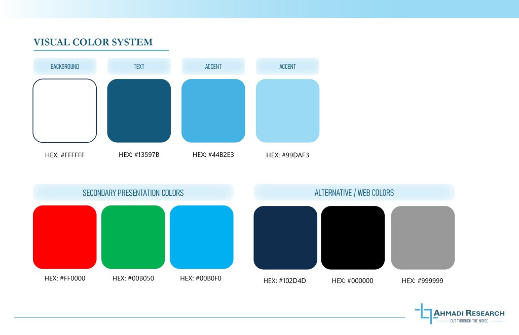
This client was looking to develop his case study portfolio, following a laboratory aesthetic to reinforce the idea of his case studies was conducted with a high attention to detail and research-backed approach. The color system leans towards a monochromatic theme of blues, though there are variations in the presentation color to denote positive and negative reinforcements.
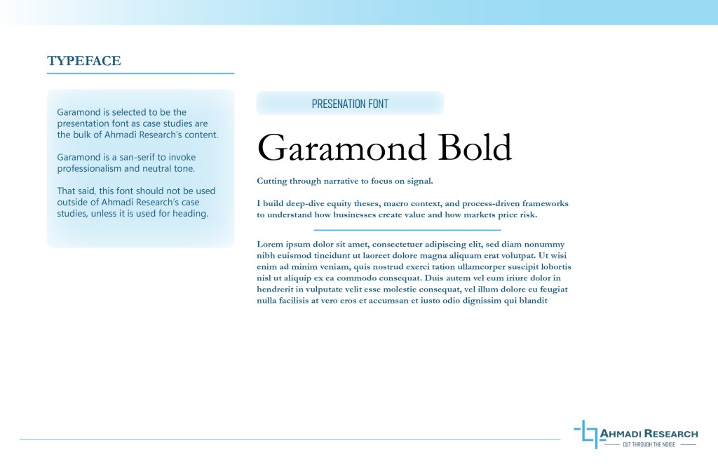
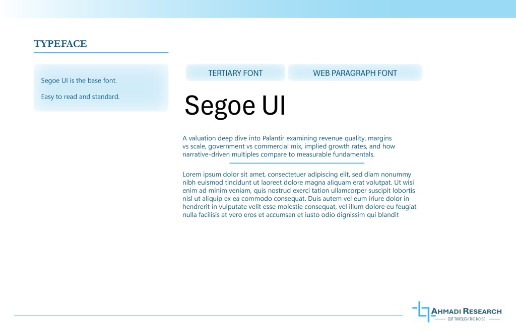
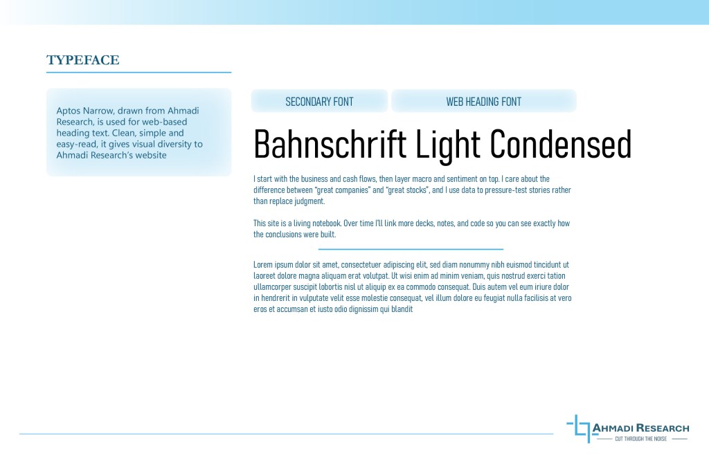
The Typefaces were preselected by the client based on the availablity of the type faces on Microsoft Powerpoint. However, I did add Banhschrift as a secondary font / web heading to add visual diversity on his website.
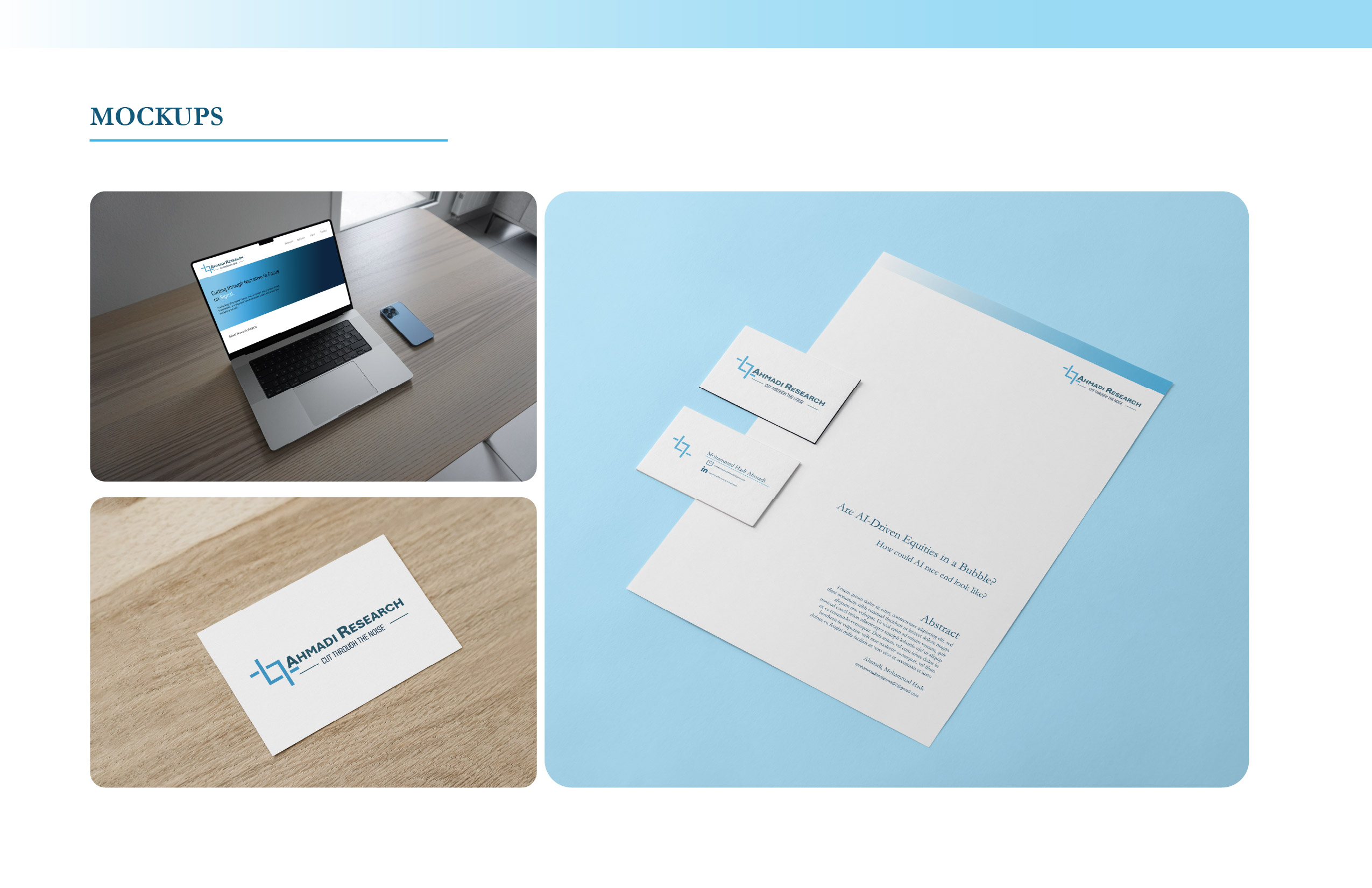
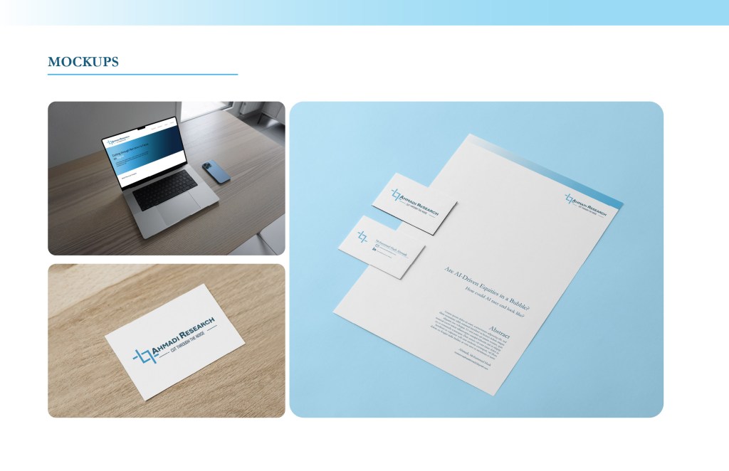
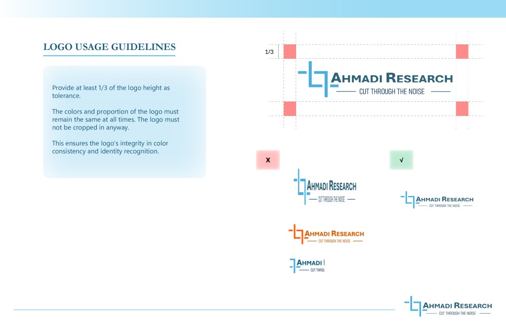
In addition to creating Logo Usage guidelines, I provided my client with svg and high quality png renderings of his logo.
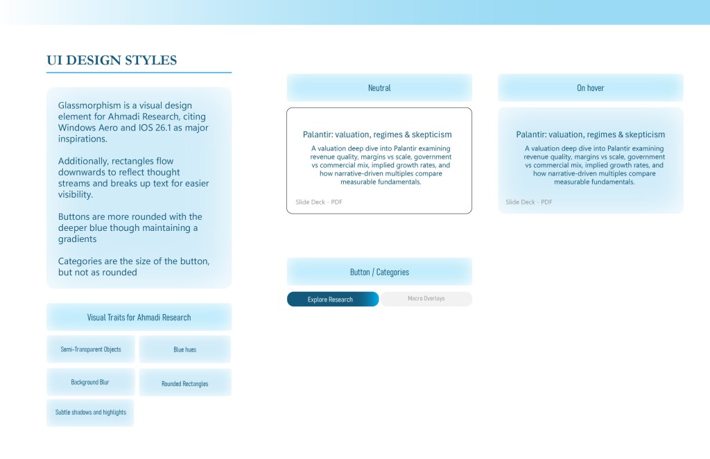
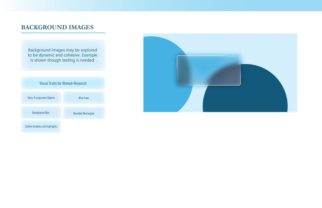
As he wanted a portfolio website, I provided him with a set of UI design styles that reflected his desire and needs of professionalism. We also explored the potential option of incorporating a glass-like effect, as he really liked the Windows Aero and IOS 26 design style.